Preview Lesson
Vector vs Raster & UI Layout
Watch the guided video after enrollment. This preview keeps the page clean while showing the lesson context and learning path.
Enroll to watchVector vs Raster & UI Layout
Lesson Notes
Student Notes
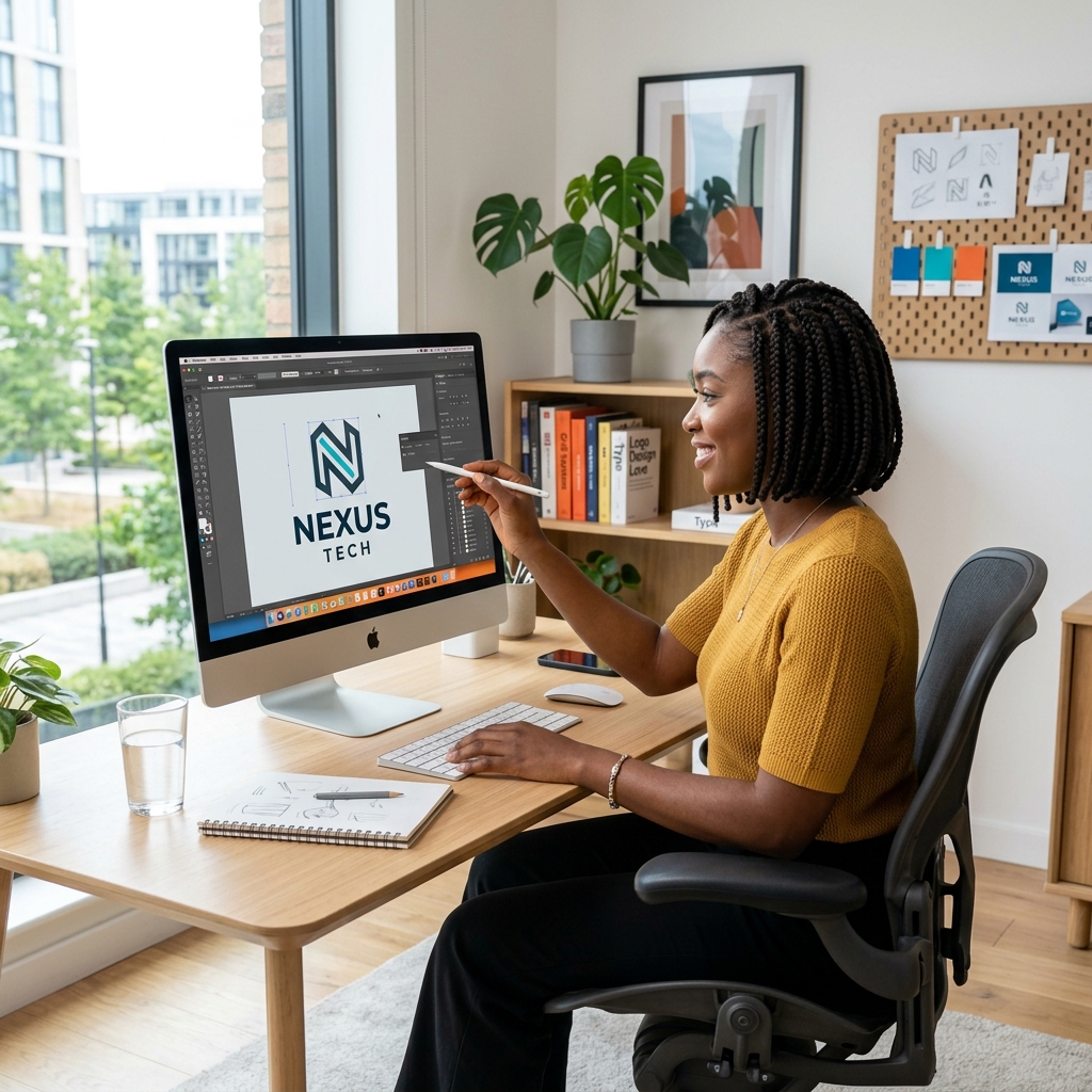
Download PDFIllustrator is a vector design tool. Vector artwork is built from paths, anchor points, curves, and fills instead of pixels. This means a logo can scale from a small social media icon to a billboard without becoming blurry.
Raster images depend on resolution. If you enlarge a small raster image too much, it pixelates. Vector artwork stays sharp because Illustrator recalculates the shape mathematically. This is why logos, icons, typography, packaging marks, and brand assets are usually created in Illustrator.
Artboards work like separate pages inside one document. You can create a logo, business card, letterhead, and social media layout in the same file using different artboards. This keeps a brand project organized.
Use RGB for screen work and CMYK for print work. RGB is built for light on screens, while CMYK is built for ink. For logos that will be printed in Kenya, CMYK setup helps reduce unexpected color shifts.