Beginner to Intermediate
Adobe Photoshop Masterclass
This comprehensive 30-day program takes you from absolute beginner to professional-level Photoshop user. You'll work on real client projects, build a portfolio of finished designs, and gain the skills to take on paid freelance work. Samuel Kimiri walks you through every tool, panel, and workflow with patience and clarity.
Full Curriculum
What you will learn week by week
Lessons include notes, resources, assignments, and quizzes where available.
1. Introduction to the Photoshop Workspace
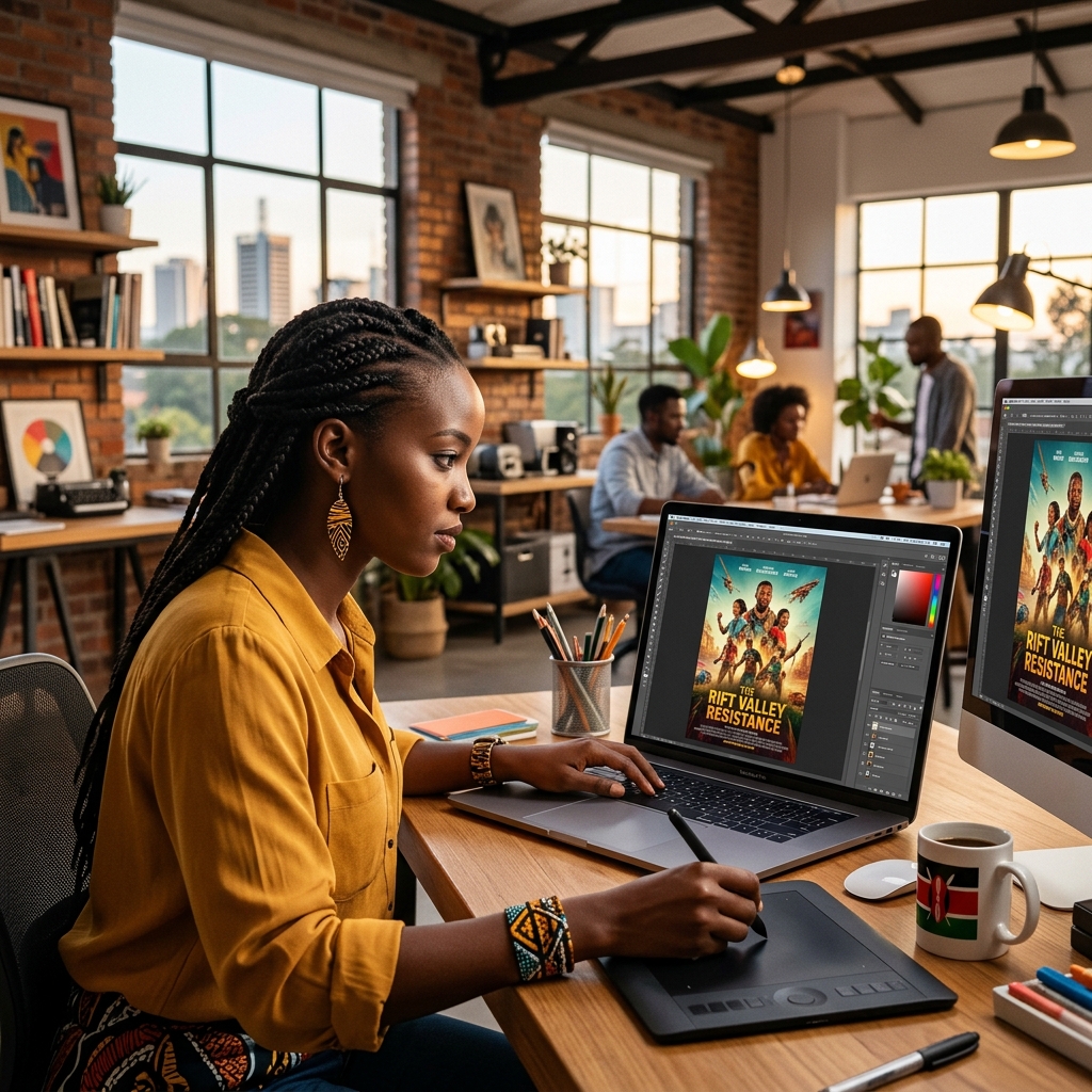
18:30Photoshop is a raster image editor, which means it builds images using pixels. This is perfect for photo editing, posters, banners, mockups, social media graphics, and digital artwork. The most important idea in this lesson is workspace control: when you know where tools, panels, and document settings live, you stop guessing and start working like a designer. The Toolbar holds the tools you use directly on the canvas. The Move Tool (V) positions layers, the Brush Tool (B) paints, the Type Tool (T) creates text, and selection tools help isolate parts of an image. The Options Bar changes depending on the selected tool, so always check it before assuming a tool is not working. The Layers panel is where professional Photoshop work happens. Each image, text object, shape, or adjustment can sit on its own layer. This allows you to edit one part without damaging the rest of the design. The History panel helps you step backward, but good designers rely more on layers, masks, and smart objects than on undo. Document setup matters before design begins. Use 72 DPI for screen graphics like WhatsApp posters and social media posts. Use 300 DPI for print work such as flyers, certificates, posters, banners, and business cards. RGB is normally for screens; CMYK is safer for print. Always name your file properly and save a PSD copy so you can edit layers later. From the full Photoshop Masterclass notes, remember that graphic design is not just decoration. It communicates, persuades, builds identity, and captures attention. A poster, flyer, or social media advert should have a clear message, a target audience, and a reason for every visual decision. The main design elements are line, shape, color, typography, texture, and space. Lines guide the eye, shapes structure information, color creates emotion, typography controls readability, texture adds feeling, and white space gives the design breathing room. The core principles are balance, contrast, emphasis, alignment, proximity, repetition, movement, and unity. Before opening Photoshop, ask: What should the viewer notice first? What should they do after seeing the design? File formats matter in professional delivery. Save editable work as PSD. Export JPEG for photos and online sharing, PNG for transparent graphics and logos, PDF/TIFF for print, GIF for simple animation, and SVG only when preserving vector-style web graphics. A good workflow is: save the PSD first, then export the final version required by the client or platform.
2. Mastering Layers & Blending Modes
22:15Layers are the foundation of non-destructive editing. A layer is like a transparent sheet placed above or below other sheets. The order matters: layers at the top of the panel appear in front on the canvas, while layers below appear behind. Good layer habits make your work faster and cleaner. Rename important layers, group related items with Ctrl+G, and keep text, images, backgrounds, and effects separated. When a client asks for changes, organized layers save time and make you look professional. Blending modes change how a layer interacts with the layers underneath it. Multiply is useful when you want to darken or remove white areas, such as adding paper texture or shadows. Screen is useful for removing black areas, especially light leaks, sparks, glows, and lens effects. Overlay increases contrast by combining light and dark information. Opacity affects the whole layer, including effects. Fill affects the layer content but can leave layer styles such as shadows or strokes visible. This difference is useful when creating advanced text effects, watermarks, and subtle overlays. Layer types include normal raster layers, text layers, shape layers, adjustment layers, fill layers, smart objects, and the locked background layer. Text and shape layers remain editable until rasterized. Adjustment layers are especially important because they change brightness, contrast, hue, saturation, and tone without permanently damaging the image. Layer styles are non-destructive effects added from the fx button or Blending Options. Drop Shadow separates an object from the background. Inner Shadow creates an engraved feeling. Outer Glow and Inner Glow help with neon, light, and emphasis. Stroke adds an outline. Gradient Overlay and Pattern Overlay add stylish fills. Bevel and Emboss can create a raised or carved 3D look, but should be used carefully so the design does not look cheap. Use layer groups when a design becomes complex. Group backgrounds, images, text, effects, and call-to-action elements separately. Copy and paste layer styles when several elements need the same visual treatment. This keeps posters, mockups, and social media templates consistent and easier to edit.
3. Selections & Advanced Masking
25:00Selections allow you to work on one part of an image without affecting everything else. A strong designer knows when to use fast tools and when to use precise tools. Quick Selection is useful for simple subjects with clear edges. The Pen Tool is better for products, logos, hard edges, and professional cutouts. Masking is better than erasing. When you erase, pixels are destroyed. When you mask, pixels are only hidden. In a layer mask, white reveals and black hides. Gray partially hides. This means you can correct mistakes later, soften edges, and blend images naturally. Select and Mask is especially important for hair, fur, fabric, and soft edges. Tools like Refine Edge help Photoshop detect fine details that normal selections miss. After cutting out a subject, check the edges against both light and dark backgrounds because mistakes often hide on one background but show on another. A clean cutout should match the lighting, color, sharpness, and shadows of the new background. Selection is only the first step; believable compositing also needs adjustment layers, shadows, and edge cleanup. Selections can be modified after creation. Feather softens the edge, invert selects the opposite area, and expand or contract adjusts the selection boundary. Ctrl+T opens Free Transform, where you can resize, rotate, flip, warp, distort, and change perspective. These tools are useful when placing products, people, or text into a composition. Content-Aware Fill, Healing Brush, Spot Healing Brush, and Patch Tool help remove unwanted objects and repair image areas. Spot Healing automatically blends small marks. Healing Brush lets you choose a clean source area. Patch Tool is useful for larger repairs where texture must match the surrounding area. Filters are creative and corrective tools. Gaussian Blur softens backgrounds and shadows. Motion Blur creates speed. Smart Sharpen and High Pass improve detail. Add Noise adds grain or realism. Reduce Noise cleans low-light photos. Emboss, Oil Paint, Lens Flare, Clouds, Lighting Effects, and Displace can create special visual styles. Convert a layer to a Smart Object before applying filters so the effect stays editable as a Smart Filter.
4. Professional Skin Retouching
28:45Professional skin retouching is about improving a portrait while keeping the person natural. The goal is not to remove all texture. Real skin has pores, small lines, and tone variation. Over-smoothing makes a face look plastic and unprofessional. Start with basic cleanup. Use Spot Healing Brush for small blemishes, dust, or temporary marks. Use Clone Stamp when you need more control over the source area. Work on a separate empty layer where possible so the original photo remains safe. Frequency separation separates texture from color and tone. The high-frequency layer keeps pores and fine details. The low-frequency layer holds color transitions and smoothness. This allows you to even out blotchy tones without destroying natural texture. Dodge and Burn is used to shape light. Dodging brightens; burning darkens. With careful low-opacity strokes, you can reduce harsh shadows, enhance cheekbones, and guide attention to the face. Always zoom out often to avoid over-editing. The masterclass notes connect retouching to blending modes and filters. Soft Light and Overlay are useful for subtle skin tone enhancement, while Gaussian Blur can support controlled softening when applied carefully through masks or Smart Filters. Avoid applying blur directly to the whole face; protect eyes, lips, eyebrows, hair, and important texture. A clean retouching workflow is: duplicate or create a safe working layer, remove temporary marks with healing tools, correct tone with adjustment layers, refine texture carefully, then shape light with Dodge and Burn. Work at low opacity, compare before and after often, and stop before the person starts looking artificial. For product or portrait work, final sharpening should be selective. High Pass with Overlay or Soft Light can sharpen important details, but too much sharpening creates halos and rough skin. The goal is clean, believable improvement, not an obvious filter effect.
5. Dynamic Typography & Poster Design
31:20Typography is visual communication. A poster can have beautiful images and still fail if the text is hard to read. Good type design uses hierarchy: the most important message should be seen first, then supporting information, then details. Tracking controls space across a group of letters. Kerning controls space between individual letter pairs. Leading controls space between lines. Adjust these carefully to make headlines feel polished and body text comfortable to read. Layer styles can help text stand out, but they must be controlled. Drop shadows, strokes, glows, and gradients should support readability, not distract from it. If the background is busy, add contrast with a dark overlay, a soft shadow, or a simple shape behind the text. Poster layout depends on balance and alignment. Use grids, margins, and the rule of thirds to position elements. Keep related information close together, leave breathing space, and avoid putting every element at the same size. A strong poster guides the eye deliberately. Text spacing is part of professional typography. Kerning adjusts space between two specific letters, tracking adjusts spacing across a word or phrase, leading controls line spacing, and paragraph spacing controls the gap before or after text blocks. Baseline shift moves selected characters up or down for special effects such as superscripts, subscripts, or stylized titles. For logo and brand projects, begin with research, rough sketches, color psychology, and font pairing before designing in Photoshop. Keep logos simple, memorable, versatile, relevant, and original. Test the logo in black and white first, then apply color. Use guides, rulers, shape tools, the Pen Tool, Smart Objects, and layer styles carefully. Poster and social media work should use the correct size and export settings. Instagram square posts are commonly 1080x1080, stories and vertical reels are 1080x1920, and print posters need 300 DPI with safe margins. Use high-quality images, readable fonts, a clear focal point, and enough spacing. For mockups, place artwork into Smart Objects so the design updates naturally on t-shirts, business cards, billboards, or phone screens. Final project workflow: create the logo, poster, and social media design in organized folders; save PSD files for future editing; export PNG for transparent designs, JPG for photos, and PDF/TIFF for print. Keep separate folders for project files, assets, and final exports so client work stays professional.
Software and tools
Projects you will build
Student testimonials
Be among the first students to review this course after completing your projects.
Course FAQ
Who is the Adobe Photoshop Masterclass course for?
It is for beginners, students, freelancers, and professionals who want practical, portfolio-ready skills.
Will I build real projects?
Yes. Each course includes guided assignments and project briefs that help you create work you can show.
Can I learn online?
Yes. You get LMS access, lesson notes, assignments, quizzes, and WhatsApp support.
Do I get a certificate?
Yes. Certificates are issued after completing the required lessons, quizzes, and assignments.
Ready to start Photoshop?
Enroll today, complete the lessons, submit your projects, and build work you can show with confidence.
Enroll in this course